Field Trip #1:
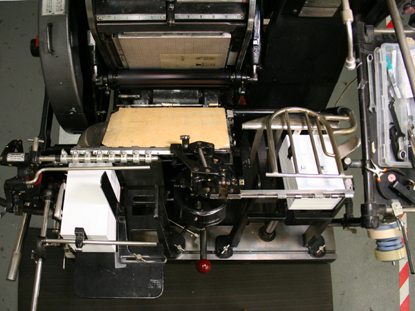
My trusty illustrator, Allie, and I took a trip to Logos Graphics and got a cool tour of the shop with John Sullivan, proprietor and printer extraordinaire. I was especially impressed by the Heidelberg “Windmill” Press even though I don’t have a project that can use it–yet! The Riso Digital Duplicator, which Lisa Rappoport recommended we use to print the text of our chapbooks (if we didn’t print it ourselves) reminded me of a cross between a photocopier and a mimeograph machine. It prints from the top like a scanner, but uses heat to make a stencil that takes the ink from the print drum. One neat thing you can do is have different colors of text by changing the ink and print
Logos Graphics is in the Project Artaud building and since it was Open Studios Saturday, Allie and I had a good time wandering through the different lofts seeing the myriad of art being made in The City. Our favorite studio was the home of Laurie Anderson, an artist working in gouache. She had the best view from Downtown SF to Potrero Hill to Twin Peaks from her window-filled work space!
Field Trip #2: Flax Art Supplies
Armed with my cover illustration and a printout of my poems, I went to Flax to look at PAPER! Flax has a giant room filled with flat files of decorative paper–it’s a treasure trove, a paper library, a papyrophile’s dream. Ok, I made up the term “papyrophile,” but you get what I mean. I spent a very enjoyable two hours going through the shelves of Canson Mei Teint cover papers as well as the Fabriano Tiziano cover papers with Nick, Flax’s paper expert. I think we went through every color combination possible, and narrowed the field from about 30 colors to 8. I had just spent 2 hours looking at cover paper–how long would it take me to find the perfect fly leaf paper for all 8 colors!?
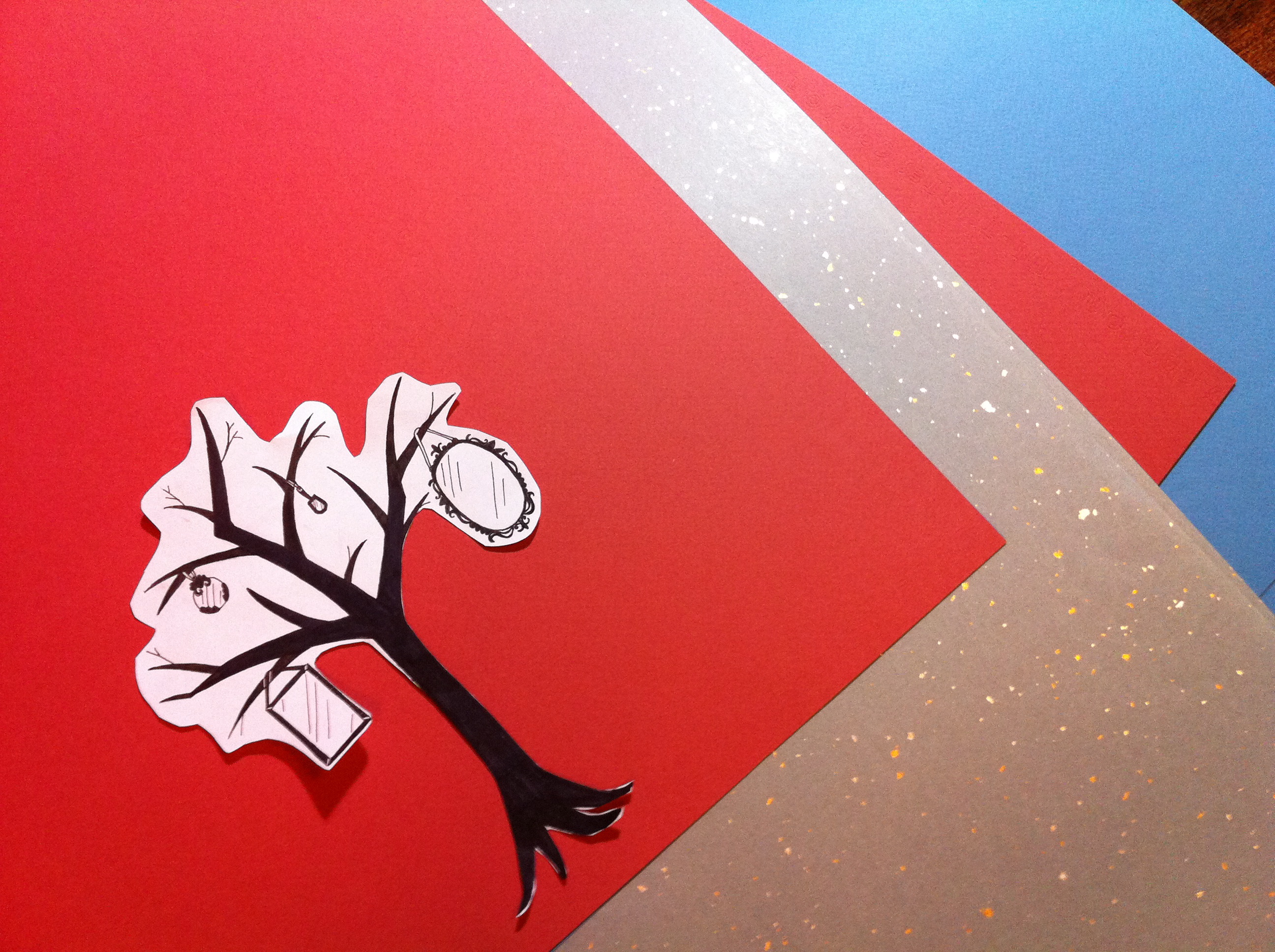
Luckily, it didn’t take me another two hours–I found a lovely lightweight gray paper with silver and gold flecks that I loved and–BOOM–everything fell into place. Which often happens, both with art projects and poems; you futz and futz around with a word or a line or a color and then something magical happens when the extraneous falls away and you are left with something you weren’t looking for, but turns out to be perfect. Like a sculptor who doesn’t “do” anything to the stone, but feels for what the stone wants to become. . .
Here’s a picture of my two cover papers and fly leaf paper, along with a cut out of the mirror tree that I’ll print on the cover: Canson Mei Teints in terracotta (though the picture makes it look darker red than it is) and Fabriano Tiziano in blue. I didn’t get the name of the fly leaf paper. . . if anyone reading this knows, I’d love to hear from you!
I’m thinking an ivory text stock would be nice, but that will be in the next post. . .


