Chapbook Design: Field Trips

Field Trip #1:
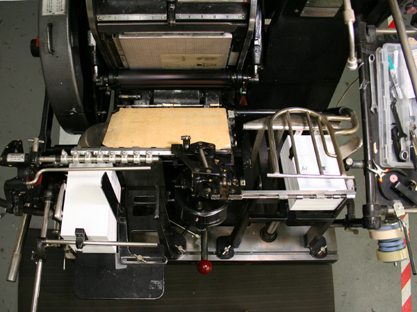
My trusty illustrator, Allie, and I took a trip to Logos Graphics and got a cool tour of the shop with John Sullivan, proprietor and printer extraordinaire.  I was especially impressed by the Heidelberg “Windmill” Press even though I don’t have a project that can use it–yet!  The Riso Digital Duplicator, which Lisa Rappoport recommended we use to print the text of our chapbooks (if we didn’t print it ourselves) reminded me of a cross between a photocopier and a mimeograph machine.  It prints from the top like a scanner, but uses heat to make a stencil that takes the ink from the print drum.  One neat thing you can do is have different colors of text by changing the ink and print

Heidelberg Windmill Press


Logos Graphics is in the Project Artaud building and since it was Open Studios Saturday, Allie and I had a good time wandering through the different lofts seeing the myriad of art being made in The City.  Our favorite studio was the home of Laurie Anderson, an artist working in gouache.  She had the best view from Downtown SF to Potrero Hill to Twin Peaks from her window-filled work space!
Field Trip #2:  Flax Art Supplies
Armed with my cover illustration and a printout of my poems, I went to Flax to look at PAPER!  Flax has a giant room filled with flat files of decorative paper–it’s a treasure trove, a paper library, a papyrophile’s dream.  Ok, I made up the term “papyrophile,” but you get what I mean.  I spent a very enjoyable two hours going through the shelves of Canson Mei Teint cover papers as well as the Fabriano Tiziano cover papers with Nick, Flax’s paper expert.  I think we went through every color combination possible, and narrowed the field from about 30 colors to 8.  I had just spent 2 hours looking at cover paper–how long would it take me to find the perfect fly leaf paper for all 8 colors!?

The Paper Room at Flax aka: Tip of the Paper Ice Berg


Luckily, it didn’t take me another two hours–I found a lovely lightweight gray paper with silver and gold flecks that I loved and–BOOM–everything fell into place.  Which often happens, both with art projects and poems; you futz and futz around with a word or a line or a color and then something magical happens when the extraneous falls away and you are left with something you weren’t looking for, but turns out to be perfect.  Like a sculptor who doesn’t “do” anything to the stone, but feels for what the stone wants to become. . .
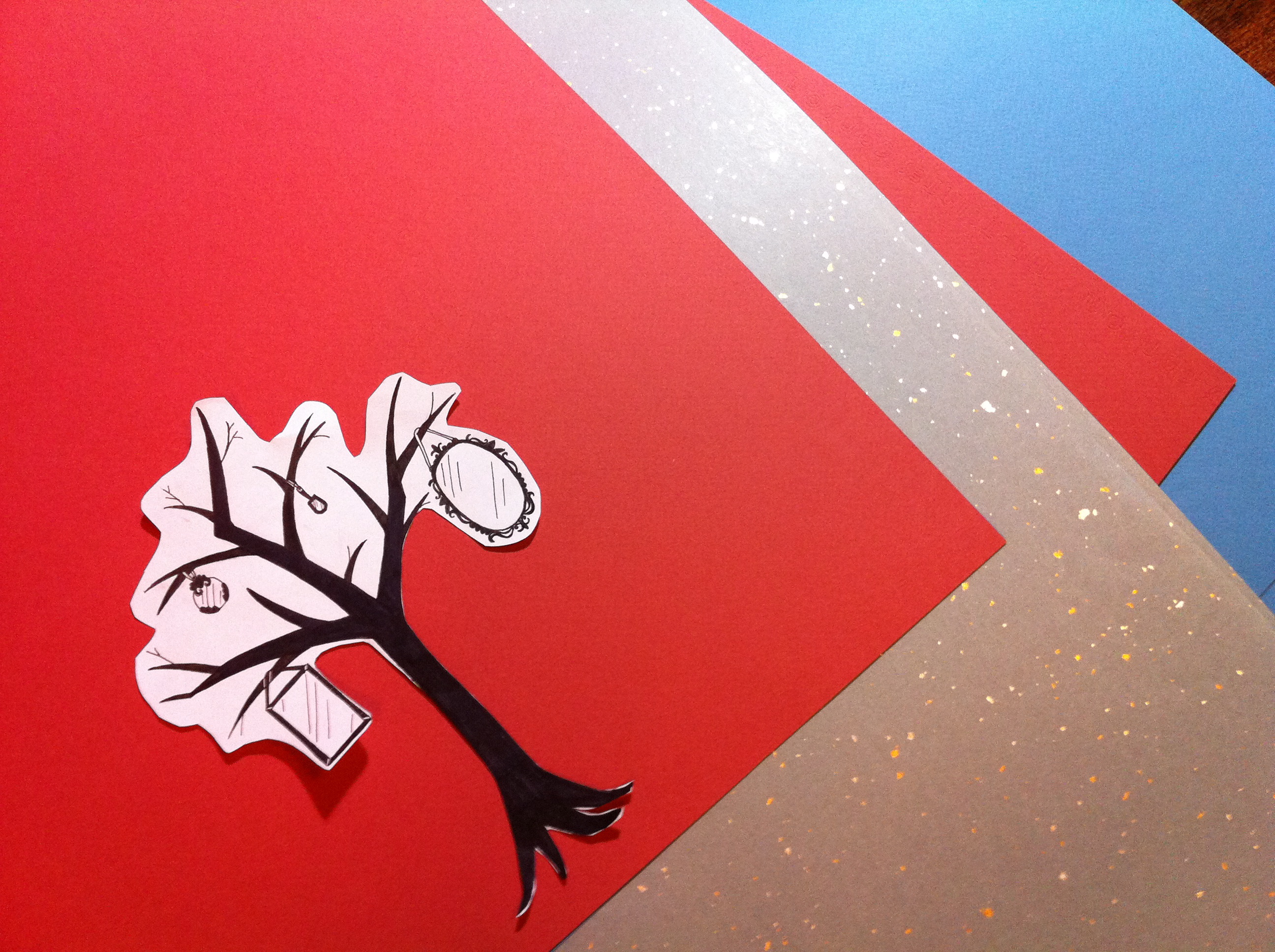
Here’s a picture of my two cover papers and fly leaf paper, along with a cut out of the mirror tree that I’ll print on the cover:  Canson Mei Teints in terracotta (though the picture makes it look darker red than it is) and Fabriano Tiziano in blue.  I didn’t get the name of the fly leaf paper. . . if anyone reading this knows, I’d love to hear from you!

Cover and Fly Leaf Paper from Flax


I’m thinking an ivory text stock would be nice, but that will be in the next post. . .
 

Designing a Chapbook

In our second class we shared how our writing had been going (intermittently for most of us!), then each poet read some work out loud and we discussed our observations. Every writer’s voice was different and I’m really looking forward to seeing how these poems develop into unique chapbooks over the course of the next several weeks!
Then on to the brass tacks of the physical chapbook:

Size/Dimensions: (I’m leaning to a 5” x 6”)
Page count:  a maxium of 24 pages (six folded folios of 4 pages each)
Text stock:  weight (from 24lb. to 60lb.) and color (bright white, ivory, or craft brown).
Cover stock:  weight (60lb., 80lb. or 100lb.), color (we looked at several examples from the Canson Mi-teints series–I was drawn to a medium blue-gray toned sample), and texture (Lisa advised against using a cover stock that had inclusions like seeds, fibers, leaves or petals and also anything too slick or reflective).
Endpapers:  decorative papers inside the cover of the book.
Binding:  we’re doing a pamphlet stitch binding.
Ink color:

We also talked about the design of the book, including:

Front Cover and Back Cover:  Text only? Or a combination of text and image?
Front matter:  which which could include some or all of the following:
Title page, acknowledgements, half title page, table of contents, frontispiece (image)
Layout:  including margins, title treatment, spacing, page numbering system (number all the pages?  only the right-hand pages, or left-hand pages? font for text vs. font for titles, use of upper and lower case type, italics, bold, etc.
Backmatter:  Author’s note or bio, colophon, epilogue.

It really made me consider all the details we take for granted when we read a book. My head was awash in considerations about what would be best for the book that still lived mostly in my head. I pondered the examples of books that Lisa and Jennifer had brought, as well as the ones I had grabbed from my shelves at home. They were all great in their way, but none of them felt quite like the book in my head. I’m sure the book will come into focus as I gather all the information needed to move forward.
Lisa also mentioned the different aesthetics that we could bring to our books, from the refined feeling of fine arts to the rawer edge of a ‘zine.  She introduced the different methods of creating our text, including the possibility of hand-writing the text and photocopying it, or working with a professional printer to print the text on a risograph machine, or making a digital file and printing it on a home computer. Each choice would influence the kinds of paper and the printing process we would choose.
She recommended that we read some of Robert Bringhurst’s book, The Elements of Typographic Style and I found his advice both comforting and poetic:

“Think of the blank page as alpine meadow, or as the purity of undifferentiated being.”

“Typographically, poise is made of white space.”

“Allow the (type)face to speak in its natural idiom.”

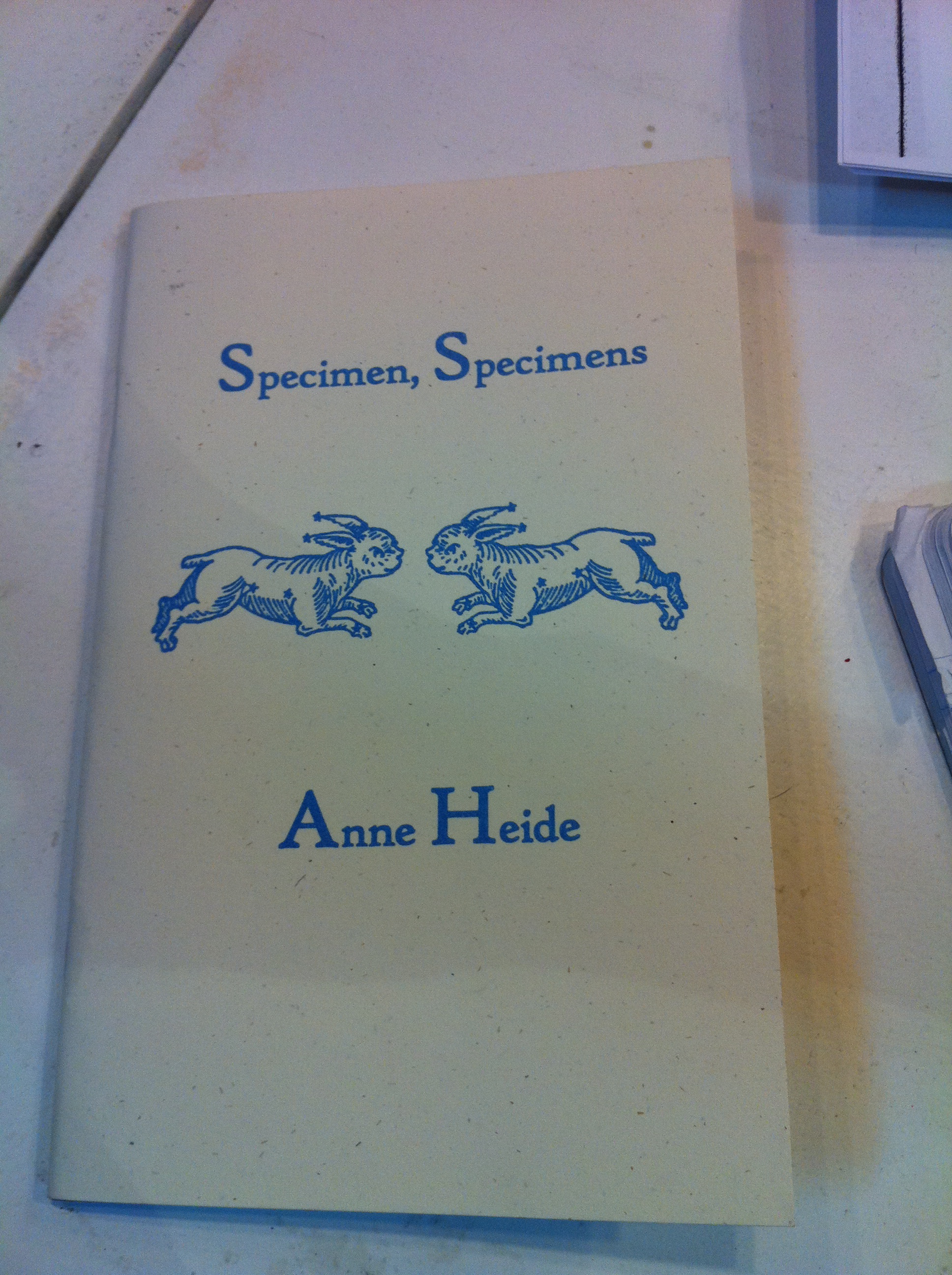
These words made me happy and I know I’ll feel their wisdom as I get deeper into the design of the book. For me, this chapbook by Anne Heide embodied the elegance and simplicity of Bringhurst’s ideas:

Front Cover


Then it was time to get down to the nitty gritty of writing. I did free writes based on these prompts from Dan:

Write about a place you miss.
Write a letter saying goodbye to someone.
Write a rhopalic poem.

A rhopoalic is a poem where each line is one syllable longer than the line before. It ends up growing into a triangle set on its side

A
AB
ABC
ABCD
ABCDE
ABCDEF

and so on! Such a fun puzzle. I’m working on mine at home, but check out Brenda Hillman’s poem, “Rhopalic Aubade”.
Next up:  Field Trip to Logos Graphics!

Fortune's Poetry: A Poetry and Letterpress Workshop

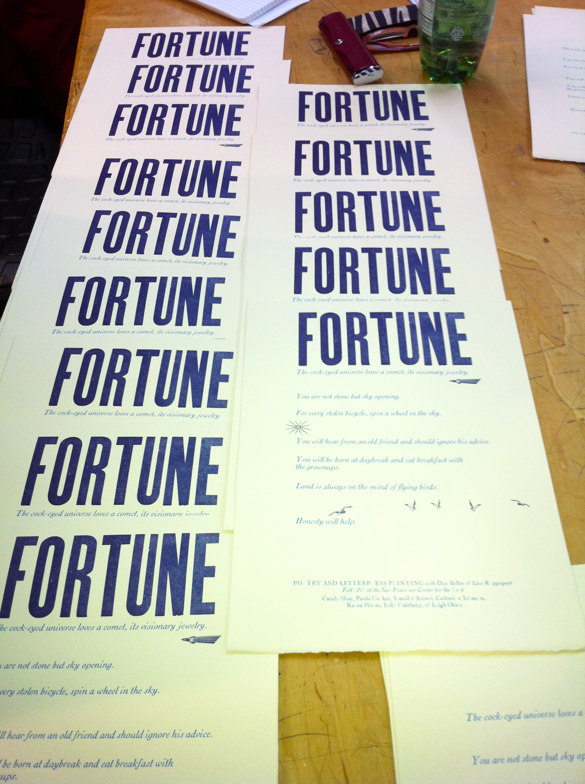
Our Fortunes All Lined Up and Ready to Go.


Poetry and Letterpress!
It was good to be back at the San Francisco Center for the Book, starting a Poetry and Letterpress printing workshop taught by the crack team of Dan Bellm and Lisa Rappoport.  I had taken letterpress printing classes before, including one where I made poetry coasters on their tabletop Platen presses, but this was the first time the center has offered a combined class for writing and printing.  A match made in heaven, oh yes!
First off, Lisa and Dan reviewed the course schedule and we introduced ourselves.  There are six poet/printers, all women, with varying degrees of experience in writing and/or printing and graphic design. We were all excited and a bit scared at the prospect of writing and creating a chapbook.  The word “disoriented” was used quite a lot during the introductions!
Then Lisa gave us a tour of our new best friend (fiend?), the Vandercook Press.  We had each sent a line of a poem to her before the class and she set the type and arranged it on the press bed before we arrived.  The assignment was to write a line that you would find in a fortune cookie or horoscope and we were all eager to see how our collaborative poem turned out.  Each of us got to run five copies of the broadside, which Lisa had chosen to print in a beautiful blue ink.
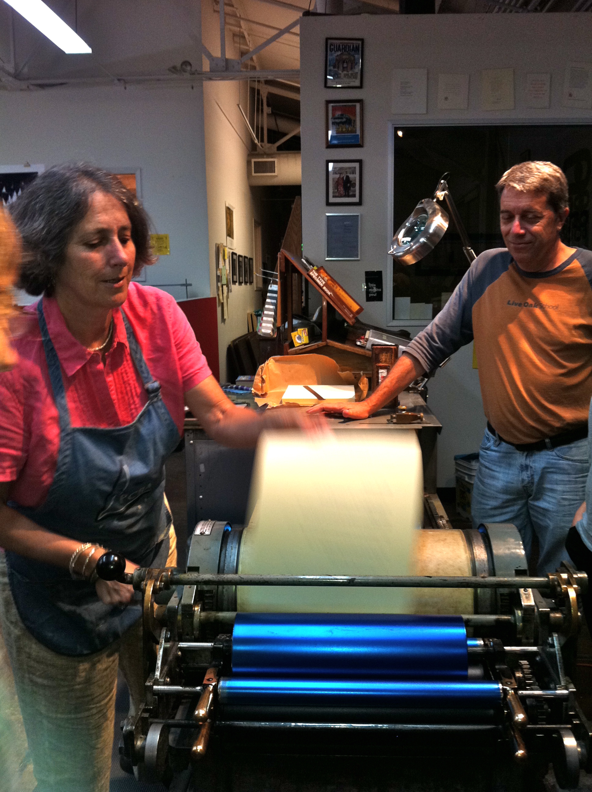
Lisa Rappoport and Dan Bellm in Action.


Some of us had never used a press before and had to get a feel for the motion of the press.  It had been a long time since I’d done any printing, so the review was most welcome! First, you have to press a foot pedal in order to insert the paper along the guides of the impression cylinder, then turn the handle with one hand while holding the paper gently with the other until the drum rolls it over the type, all the while walking alongside the press and lifting the printed sheet off the impression cylinder at the end of the press bed.  Sound easy?–I almost crashed the cylinder at the end of the run on my first try!  Oops–don’t know me own strength, I guess!
Some of the letters weren’t printing completely, which is pretty typical for a first try, since old metal type gets worn down over years of use.  Fonts made by different foundries also vary in how much pressure they need in order to print cleanly and Lisa added several sheets of paper to the impression cylinder to properly adjust the level of the printing surface.  Such is the life of a printer!  For printing groupies like me, here are the fonts that were used in the broadside:
Text:  18pt Cochin Light Italic
Colophon/Blurb:  12pt Cochin Light Italic & Roman
Title:  Wood type
Lisa then added some red to the blue ink to make a deep purple for the second color of the broadside, and spent considerable time removing the text type and setting the title and graphics.  We had a chance to peruse the variety of chapbooks Lisa had brought for us to see–I was in love with a tiny square chapbook titled “Rayon Vert,” that featured letterpressed interior type and a beautiful graphic of a human heart printed on green vellum.  Maybe one day I’ll be able to make something so gorgeous!
When the title was ready to go, we all stepped up for our second round of printing.  The finished broadside was fun and had a retro feel and we marveled at how cool the poem turned out since none of us knew what anyone else was going to write.  “Those Surrealists were really on to something when they made up their parlor games (the Exquisite Corpse),” Dan observed.  We had to agree–even though everyone sent in their writing blind, several of the lines in the poem invoked the sky in some way.  This poem wrote itself, even over email!  I had actually written a whole page of lines, but chose this one to send in:  “The cock-eyed universe loves a comet, its visionary jewelry.”  When I looked at what the rest of the lines I could have sent, I was amazed to see that that the one I sent fit the best.  And Lisa included a cute retro graphic of a comet streaking across the page too.  You can read the whole poem and get a better look at the broadside by clicking on the picture below.
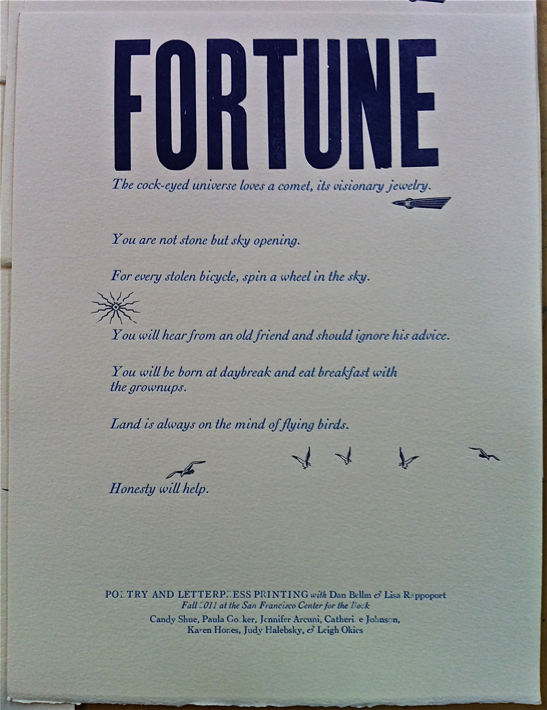
Fortune: A Collaborative Poem.


Because it took a bit longer to print the broadside than we’d thought (ain’t that always the way?), Lisa kindly offered to clean the press so we could do some free writing exercises that Dan had planned.  For the next hour, we wrote about rooms we had stayed in, things we had overheard that day, things we had lost, and what we were afraid of.  I was happy just to be writing, though I couldn’t say anything I was doing looked remotely like poetry.  Dan then had us look over our exercises and underline anything that caught our attention or looked interesting.  One thing I underlined was the line, “If we can’t get a fucking cup of coffee in 23 minutes, I’ll pay your parking ticket!” which I swear I had just heard that day on Gough Street, near Hayes Valley.  My guess was that the four guys getting out of a silver sedan were going to go to the Blue Bottle Kiosk on Linden Street.  That’s where I would go–ummmm.
For the last exercise of the evening, Dan asked us to write a letter to ourselves, either using the material from the free writes or not.  I did, and was pleasantly surprised to feel the disparate material I had underlined create an associative emotional tone through its illogical narrative.  Afterwards a few people read their poem-letters and it was cool to see how different each one was–some were more traditional (and coherent) than mine, others very humorous or philosophical.
Then it was time to gather our fresh-off-the-press poetry and head home.  Thanks to Paula, Jennifer, Catherine, Karen, Judy and Leigh for their poetry–and to Dan and Lisa for a terrific first class!  I’m really looking forward to working with everyone at the next one and I hope to post blogs after each class so people can see the process of making a chapbook on a letterpress printer!
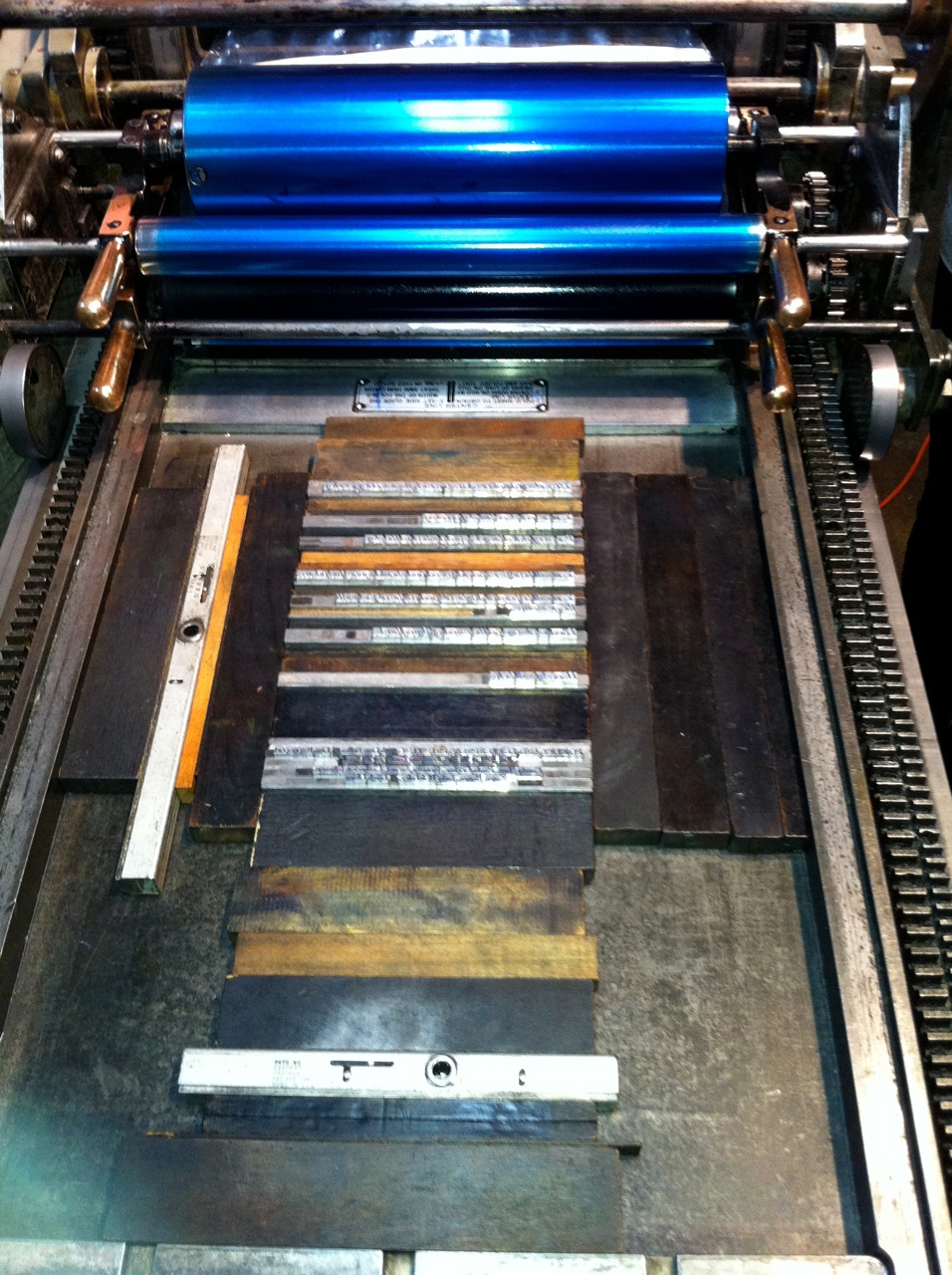
Our beloved Vandercook, ready to roll.